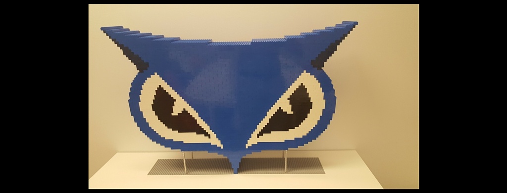
We're a tad obsessed with our owl logo. Cybereason's U.S. and Tel Aviv offices are adorned with owl paraphernalia. At Black Hat last year we had a massive Lego sculpture of our beloved owl built. It's now perched in a conference room at our Boston headquarters. You can see our Lego owl sculpture in the photo at the top of this blog.
But out of all the possible animals and symbols we could have selected, how did we determine that a blue owl best represents Cybereason and our take on cyber security? To answer that question, we reached out to Ilan Dray, whose digital agency, Inkod Hypera, developed our owl.
Super heroes were part of Dray’s inspiration after he and the Cybereason team talked about how CISOs and security analysts are like a company’s security super heroes.
“Like Superman, I wanted a strong icon in the shape of a shield, but also with the same characteristics of the dark hero Batman,” said Dray, whose the agency's founder and creative director. These concepts also explain the owl's black and blue color scheme, he added.
The super hero connection also factored into Cybereason’s user interface, which Inkod Hypera also designed. “I imagined Iron Man’s helmet, which shows all kinds of data,” Dray said. This explains why Cybereason’s user interface displays the full story of an attack, including data like what users were compromised, what machines were infected and the initial infection vector.
Dray wanted a symbol with a “strong presence” after Cybereason’s co-founders told him they wanted to take a different approach to cyber security and lead the industry.
"The icon of the owl was really clear in my mind," he said. “Bats were much too obvious a choice and not friendly enough for a startup. So I went for the owl, which has the some of the same abilities, like being able to see in the dark.”
Dray also liked the traits that owls shared with eagles: both are birds of prey that fly very quickly to capture a target. This point also resonated with the Cybereason team since our technology is built to quickly detect and shut down attacks.
While our icon may resemble a Ninox owl, the great horned owl was Dray's inspiration.
"The black horned owl's horns make it look like a perfectly symmetrical arrow going after it's target," Dray said. This worked for Cybereason since we see our technology as targeting the sophisticated malicious operations that our customers face.
When it came time to create Cybereason's owl logo, Dray wanted to emphasize the shape of the owl's "badass face." He didn't "want to make it look too childish or scary like a bat. I wanted something that looked smart and prestigious," he said.
So far, Inkod Hypera’s efforts have paid off. Our blue owl has appeared on mints, t-shirts (of course), even a food truck. We’re excited to see where our owl will land next.
Lital Asher-Dotan is Cybereason's marketing director.